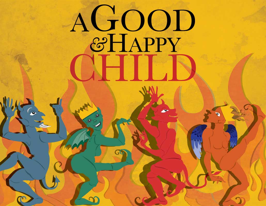
Branding
Branding
Brand Architecture
The first step in rebranding National Urban League was to assess the scope of their footprint and to understand how their affiliates identify. After doing an analysis of their nation footprint, the recommendation was to set specific naming conventions for entities across the country. The primary reason being a consistency and building recognition and ultimately trust with a broad audience.
Click here for PDF of brand guidelines

Messaging
Developing messaging for the NUL is a matter of expressing the intent of the organization on a basic and humanistic level. The work of negotiating civil rights is ultimately the effort to attain the promise of the founding fathers: for every man to be guaranteed life, liberty and the pursuit of happiness. This statement echoes the Maslowian sentiment of the hierarchy of needs; the idea that for one to truly experience the happiness of self-actualization, one must procure basic human needs. The concept is patriotic and humanistic. In essence, the fight for civil rights is the fight for liberty for all and the right to be happy.


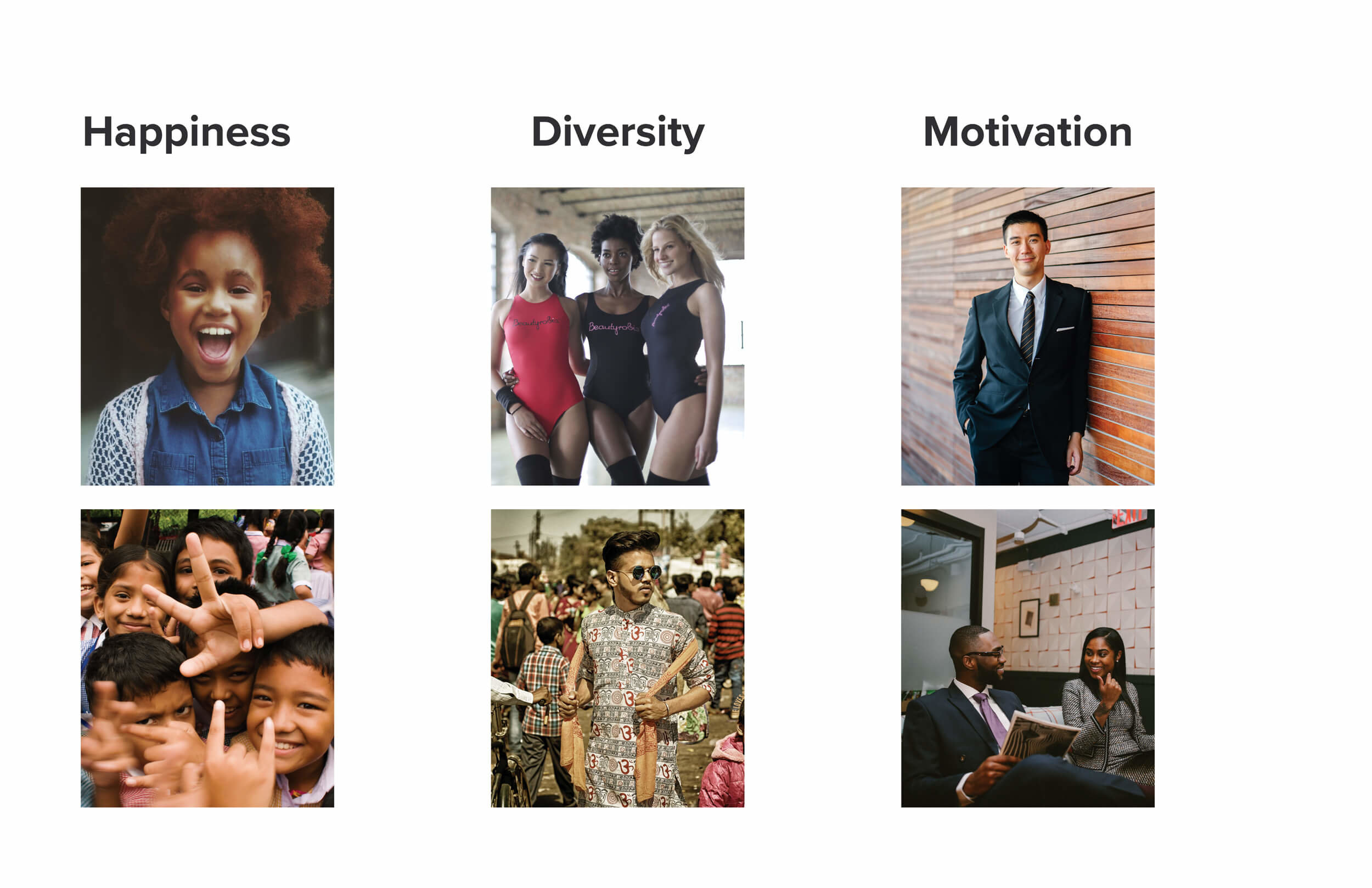
Imagery, Typography & Color
Once messaging and core creative concepts are established, these become the conceptual driver for all visual development. The visual elements such as imagery, typography, and color are all extensions of the motivations outlined in the brand’s core messaging. The imagery is human-centric and depicts happy, motivated individuals, the typography is modern and bold, and color is chosen to express the renewed sense of energy and purpose for National Urban League.


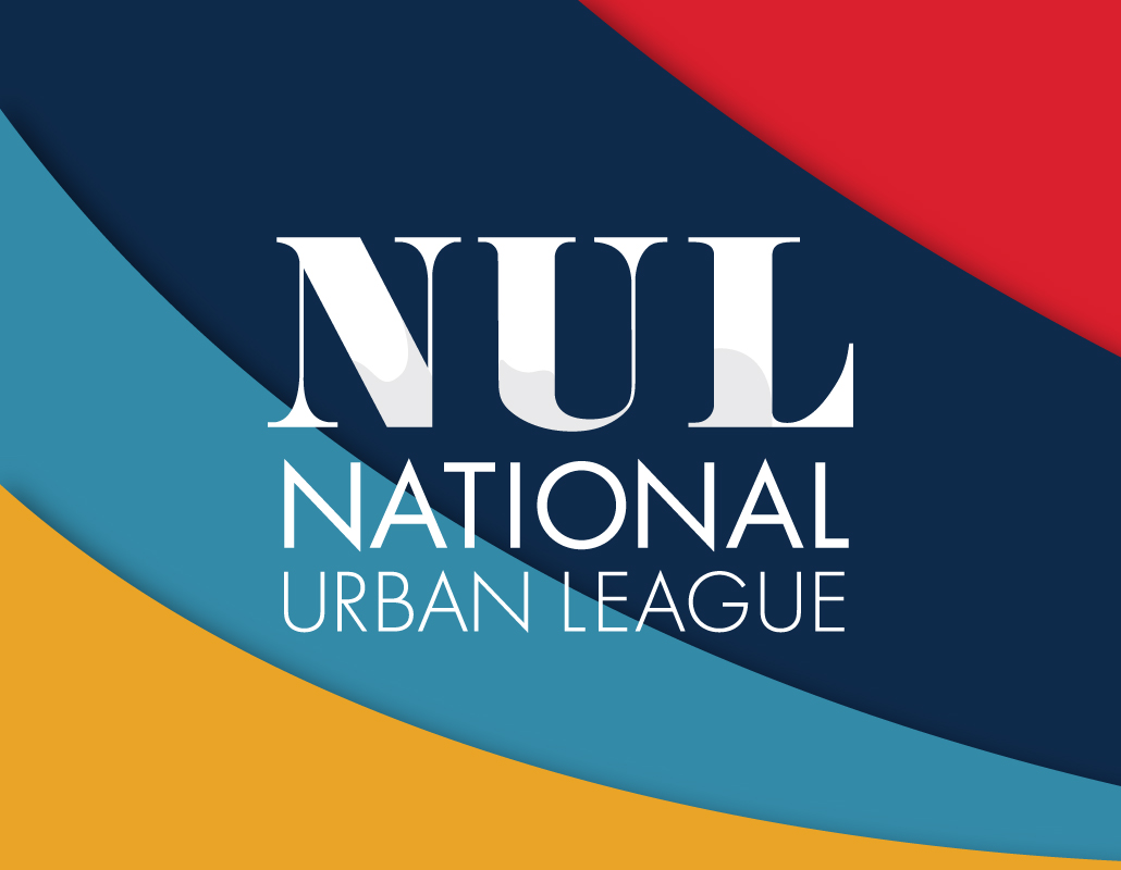
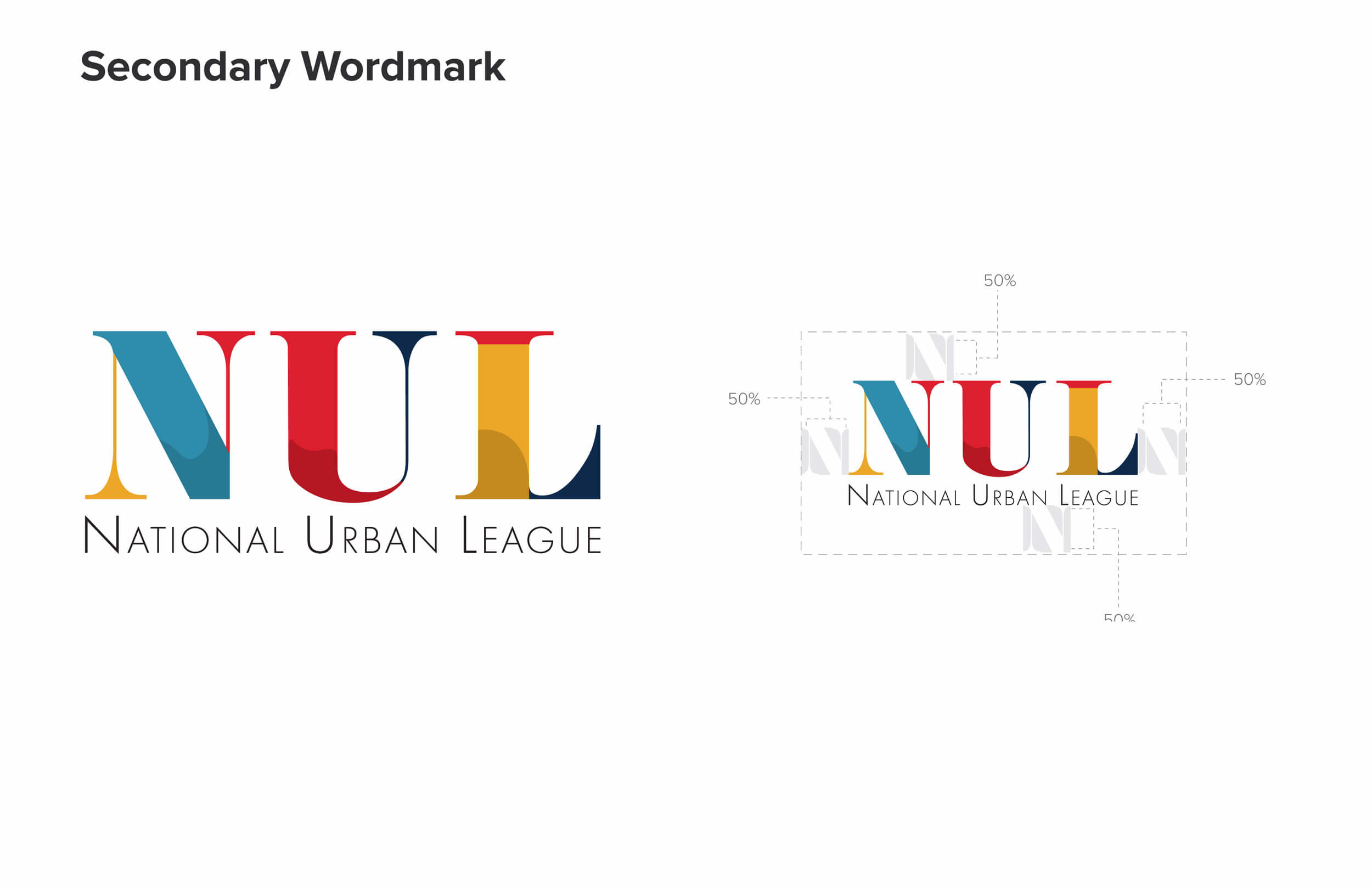
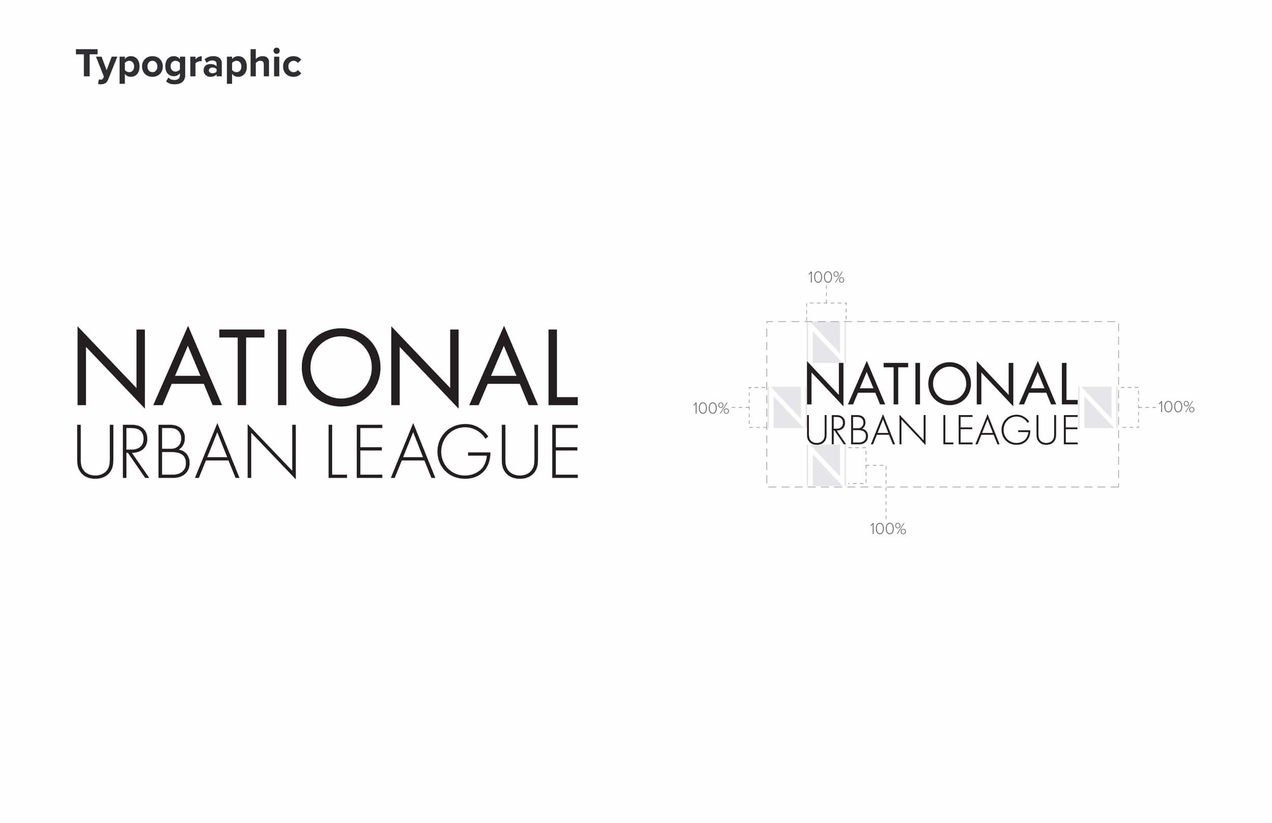
National Logo Configurations
Here, the primary considerations for logo development becomes translating the concepts of the brand’s vision, mission and values into a visual mark and addressing the organization’s brand architecture in a systematic manner. The mark itself honors the prolonged history of the NUL by utilizing typefaces that are grounded and ‘mature’. Part of the typographic configuration is then treated like a space to visually impart ideas of diversity and the kinetic energy of a society that is constantly changing in an effort to better serve its citizens. The end result is an effort to belay the National Urban League’s profoundness as a long-standing institution as well as their continued commitment to progression.

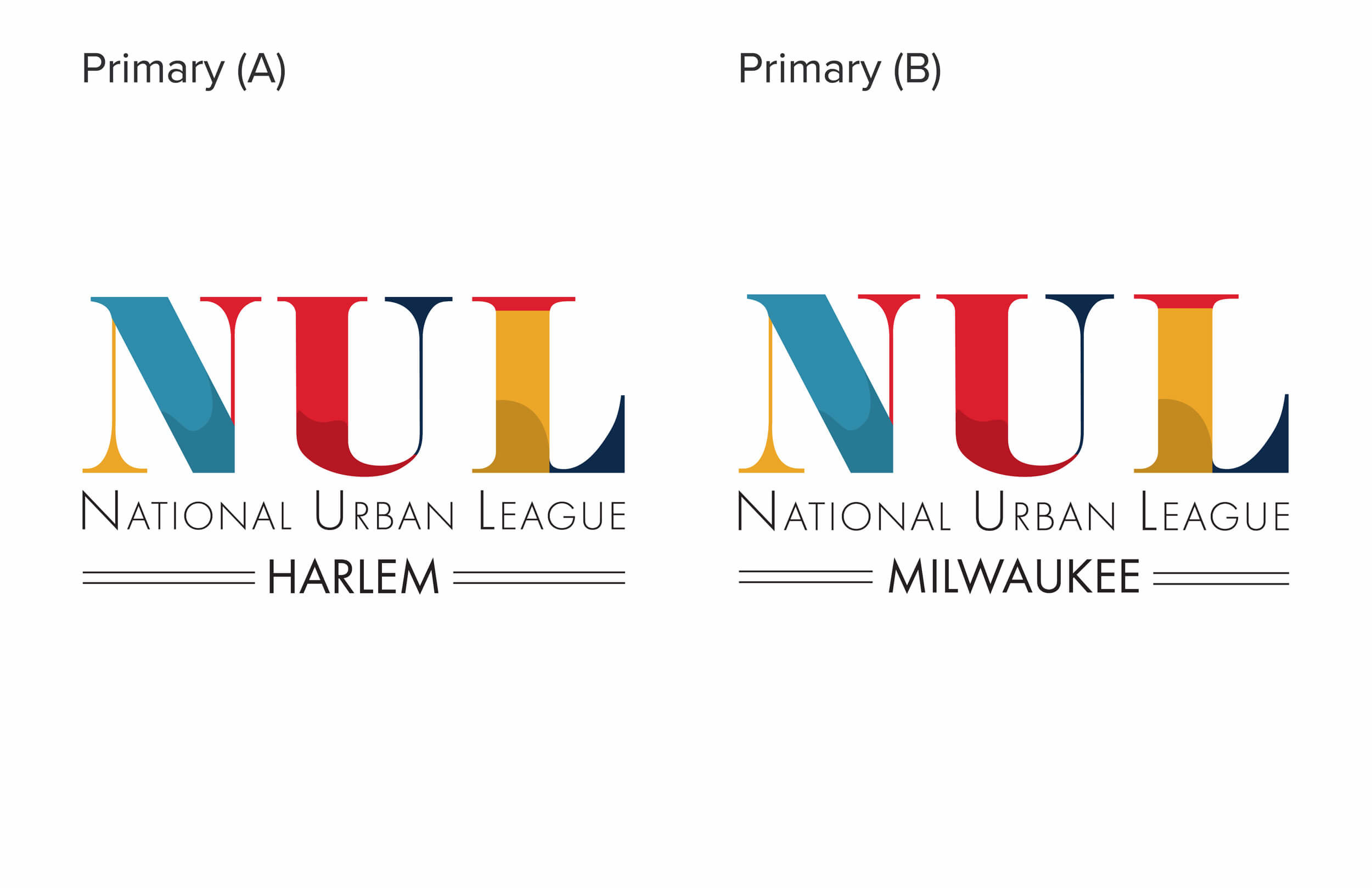
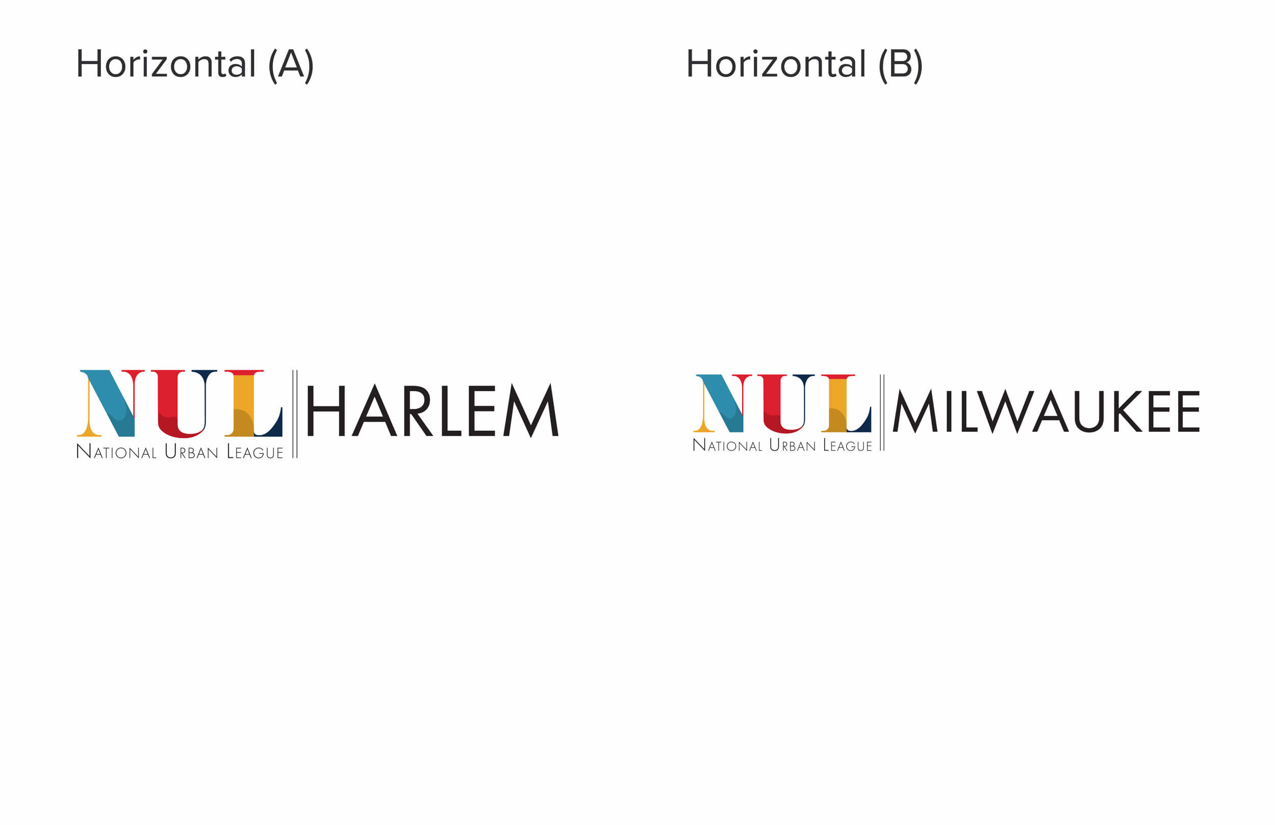
Municipal Logo Configurations
For creating municipal variations of the primary logomark, the major concern was to address the sheer diversity of form when it comes to accommodating the names of various locations. The challenge is making a mark that accommodates a Laos, New Mexico branch while also congruently accommodating the likes of a Chattanooga, Tennessee chapter of the NUL.
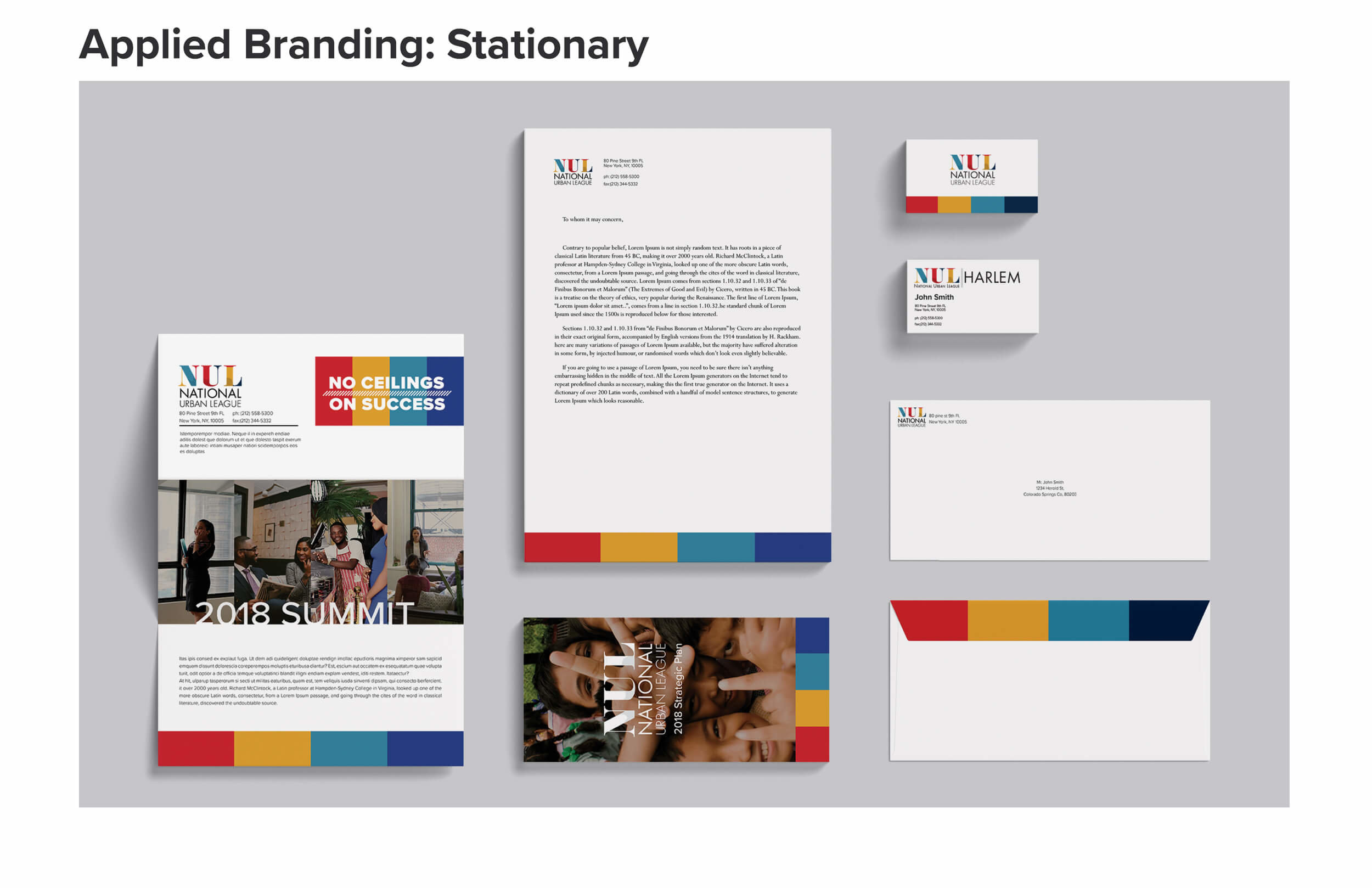
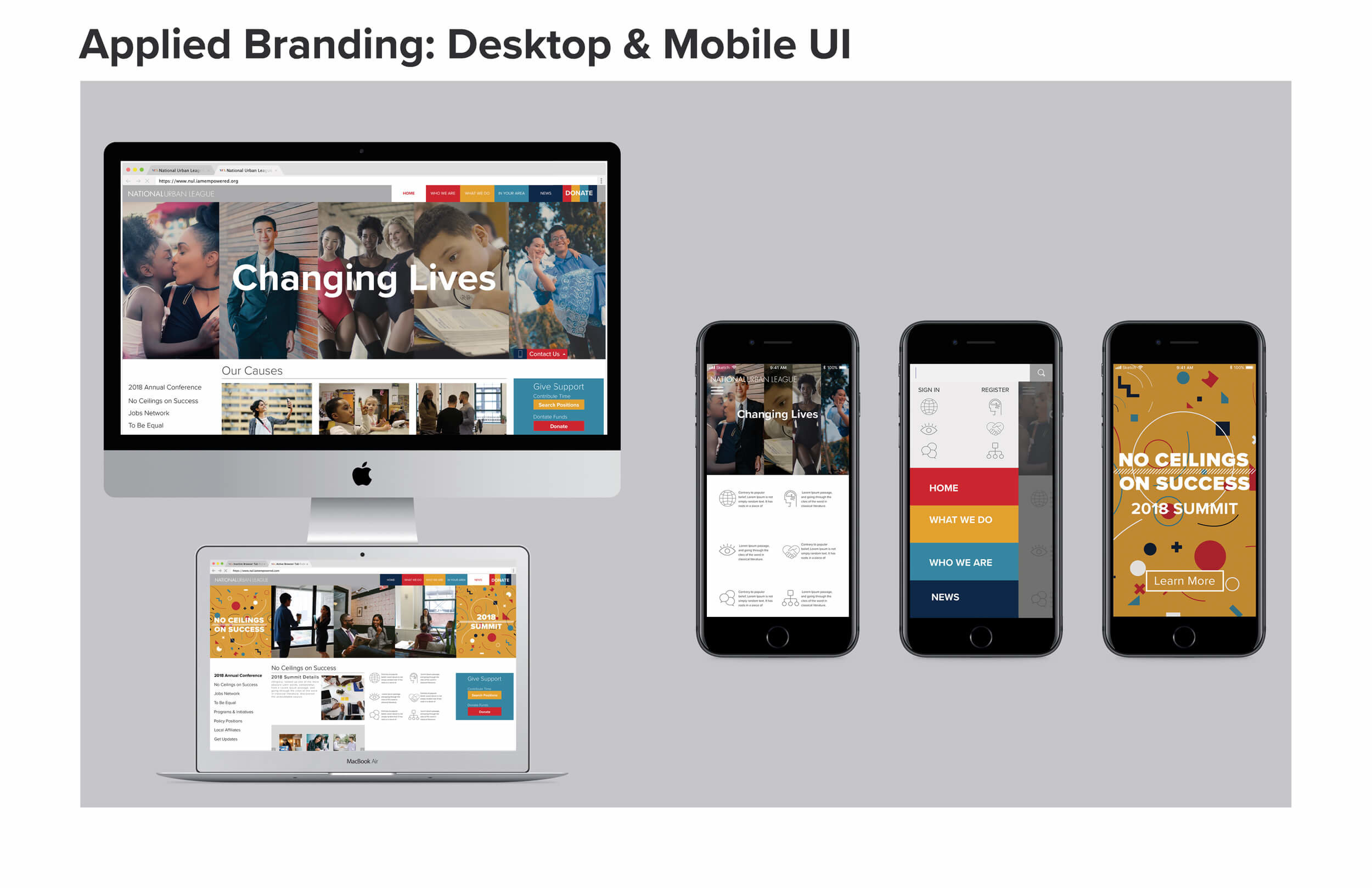
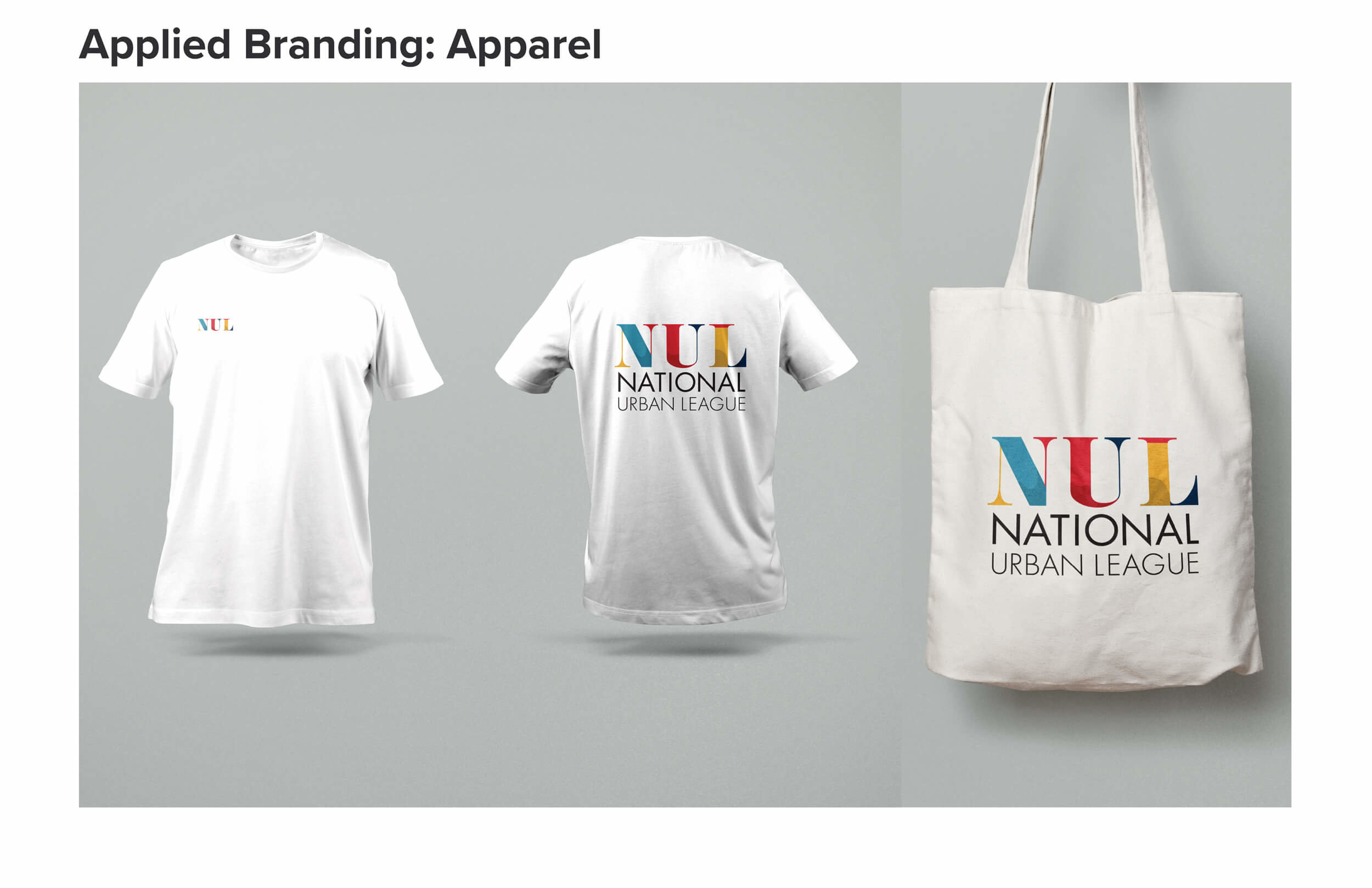
Applied Branding
The applied branding visualizes the brand through various media relevant to regular operations for the NUL. In applying the brand physically to various media, there must first be an effort to adhere to the standards established in the brand guidelines. Additionally, care is taken to implement elements in ways that visually convey the concepts and values that are foremost in the brand’s core creative concepts. Overall, the intent is to capture the unappreciated zeal and spirited resolve of the civil rights workers.